_edited.jpg)


Purdue Polytechnic Institute

This project was focused on redesigning the Office's website and social media templates. The Purdue Polytechnic Institute Office of Globalization hoped to reach out to more students and to have more effective ways of displaying their information. As a sponsored project in my UX Design studio, our team was challenged to do the redesign.
Project Overview
Sponsor - Office of Globalization
The Office of Globalization is committed to increasing cultural and global awareness, providing intercultural development opportunities for students, and providing study abroad opportunities within the Polytechnic Institute.
Design Challenge
Our team was tasked to redesign the Purdue Office of Globalization website and social media to better reach students and disseminate information to them. This goal was created because Polytechnic students are not communicating with the Office of Globalization prior to studying abroad even though they are an integral part of the process.
Targeted User Group
Purdue Polytechnic students who want a study abroad experience during their time at Purdue.
Tools Used
- Whimsical
- Figma
- Canva
Research Techniques
- Best Practices
- Heuristic Evaluation
- Competitive Analysis
Deliverables
- Website Redesign Mockups (High Fidelity)
- Updated Social Media Templates
- Design Documentation
Personal Contributions
as a team member
Research
- Conducted Competitive analysis
- Conducted heuristic evaluation
- Conducted Usability Testing on current website
*Competitive Analysis: research strategy to learn more about similar existing devices.
*Heuristic Evaluation: a research strategy to identify current issues in a platform using heuristics.
Communication
- Communicated with Sponsor
- Spoke with the Project Management team (project managers & project owners)
- Collaborated with team.
*Project Managers: professor of the studio class
*Project Owner: A person of resources for team leaders.
Mockup Design
- Sketching lo-fi screens
- Design mi-fi screens.
- Designed a few and assisted on all hi-fi screens. (on Figma)
- Conducted Usability testing on finalized hi-fis. (on Figma)
*Figma: design program
Final Designs
Website Redesign Mockups
Social Media Templates

Final Design - How it is more effective
The current design of the website necessarily has four issues. With our designs, our team addressed these problems as shown below (these will also be discussed further in detail later in the report):
Issues
An unfocused social media makes it difficult to find relevant information
Lack of information hierarchy and organization.
Cluttered and unorganized program page
Students do not know when and how to contact the office and have difficulty navigating the website.
Our Solutions
3 main kinds of social media content
Implemented an information hierarchy by arranging content by importance.
Reimagined filtering system and program page.
Implemented Calls to Action, buttons, etc.
Our Process
While our team worked on the social media templates and the website redesign in parallel, I will be showing them separately for simplicity. We will start by looking at the social media template design process.
Social Media
Research
Website Research
Website
Ideation
Current Vs
New Design
Social Media
Ideation
Usability Testing
on Current Website
Usability Testing
on Hi-fis
Our focus when redesign the social media templates was to be more effective in communicating the office's programs, capabilities, and latest news. With this, we first conducted a current social media audit.
Social Media Research
The Social Media content audit was purpose to To identify problems in the Office of Globalization's existing social media content. With this, our team found:
- Inconsistent template use
- Text is hard to read
- The content on the templates do not share any specific information that will motivate the students to apply
With these issues, our team hoped to address these when designing the new templates.


Current Instagram Posts
Social media Best Practices
Our team research the current best practices for social media in order to Identify what types of content should be included along with best practices for social media content creation. (The best practices stem from our content audit.) We found the following:
Types of Content
Allows students to get an idea of a program before applying + adds interest
Informs students of upcoming programs, application deadlines, etc.
Helps eliminate confusion around eligibility, finances, and other perceived barriers
Sharing Past
student experiences
Disseminating
knowledge & information
Countering Student
misconceptions
With the social media research, our team moved onto ideation while considering everything that we had found.
Social Media Ideation
We approached ideation with the concern of how we could implement the three previous factors into our social media templates. After exploring other university study abroad social media templates, we designed the following (plus more designs) on Conva:

Sharing Past
student experiences

Disseminating
knowledge & information

Countering Student
Misconceptions
Now that the social media template process has been explained, we move onto the website redesign process. This was our main focus throughout the duration of this project.
Website Research
Our focus, going into the website redesign, was to redesign the website content to more effectively communicate suitable program options and prompt students to engage with the office prior to applying to study abroad programs. With this, we started with a Heuristic Evaluation and a Competitive Analysis.
Heuristic Evaluation
Our team wanted to answer the question: What are the current problem areas of the Office of Globalization website? We found the following:
Excess of...
Irrelevant Information

Screenshot from the About Us page
Overwhelming amounts of text

Screenshot from the Homepage
Lacking...
Visibility in Displaying Results

Screenshot from the Design your Global Experience page
Visual Consistency Between Pages

Screenshot from both the Homepage and Design your Global Experience pages
Competitive Analysis
Our team conducted a Competitive Analysis in order to identify how top university study abroad programs are organizing and disseminating information to students. A few of the attributes we found, that we thought would be most beneficial, were as shown below:
Engaging Visuals + Organization
Search bar + Simple filters
Information Hierarchy

With the website research collected, our team moved on to usability testing with the Office of Globalization's website.
Usability Testing (Current website)
We conducted usability testing on the current website in order to identify students' motivations, mental model, and overall experience when utilizing the website.
Testing Protocol
Takeaways
Conducted with three Polytechnic students
1. Began with five questions in order to familiarize our team with their experience with the website.
2. Two tasks performed. We asked the participants to search for a program that interests them and then to try to apply to it.
3. Post tasked questions. Our team asked the participants about their experience with the current website.
Students struggle to seamlessly navigate the website
Students do not understand the end-to-end study abroad process
Students do not understand the role of the office of globalization
With the website research collected, our team moved on to usability testing with the Office of Globalization's website.
Website Ideation
With all of the research we had done, and all of the information we had collected, we moved on to ideation. We started with sketching, then we moved in to Mid-fis, then hi-fis, and then we finished with testing and iterations.
Sketching
We conducted sketching in order to begin to visualize our ideas that were identified through research. We arranged components to match with the student journey and commonalities found in competitive analysis. And we reduced text-heavy areas and irrelevant information identified in our heuristic evaluation.


Medium Fidelity Mockups
Our focus when moving into our mid-fis was to continue to synthesize our research findings. We had disjointed ideas and used mid-fis as a way to visualize them as a whole,
Homepage

Problem: Initial banner does not have a call to action or contain info related to the office
Solution: Initial banner has call to action with a description the office's purpose
Homepage
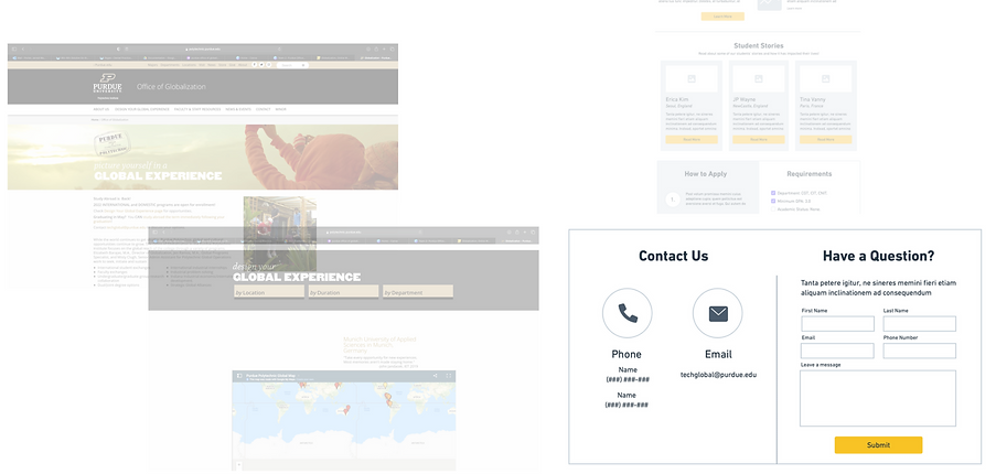
Needed to include a Call to action to contact the office. This was one of the main problems that we needed to address.

Design your Global Experience
Improved filtering system now includes a language preference and the option to clear the filters
Design your Global Experience

We moved the list of program from a chart to cards in order to allow it to be quickly looked through for different programs and their descriptions
Design your Global Experience

Problem: This page has a lot of unorganized text and is difficult to scan
Solution: Program information is now clearly organized into sections for increased readability
Our team took our mid-fis and transformed them into high fidelity mockups to create a holistic experience of our website prior to conducting usability testing.
High Fidelity Mockups
We designed the hi-fis based off of the mid-fis and then conducted testing. A few changes were made which will be shown below in the next section.
Since the changes were done directly after usability testing, I have decided not to show each individual screen before the iterations.
Usability Testing on Hi-fi Screens
Our team conducted usability testing in order to evaluate our designs. We had six participants which were Polytechnic students that were interested in the study abroad program.
Testing Protocol
User Story
Setting a scenario for the participant. Our team had the participants think of themselves who were looking to study abroad.
Tasks for Each Page
Make sure each participant can perform the tasks. We made a list of tasks that are required to do for someone who is interested in studying abroad and signing up for a program.
Post-Task Questions
Our team asked a few questions about their interaction with the hi-fis.
Takeaways
The disclaimer to contact the Office was insufficient.
The filtering system was misleading
Iterations
Before
After

"Do I have to choose from all of these dropdowns?" - quote from testing participants.
Before
After

"To be honest, I didn't even read that at all--I think my brain just ignores blurbs in boxes" -quote from a testing participant
Once the iterations were completed, our hi-fis turned into our final designs. Below are the before and afters of a few of the major screens.
Before Vs. After Hi-fis
Social Media


Homepage


About Us


Contact Us


News & Events


Global Tech Minor


Design System
In order to create consistency within the high fidelity mockups, our team created a design system based on the current Purdue design system.
Shape

Color

Actions

With these designs, we were able to turn the problems into efficient ways to bring in more study abroad applicants.
Final Design
The main issues are as followed:
Problems
Lack of communication to the Office before students apply for programs
Social media was text-heavy and not eye catching
Website lacking organization and too text-heavy
Solutions
Added a disclaimer to contact the Office before applying to programs.
Adding more eye catching visuals and reducing the amount of text
Adding an information hierarchy to organize and reduce text.